This entry explains the elements of slide design.
When you make slides, you sometimes get feedback like “The content is good, but the design isn’t quite there.” “Design” here basically means “how the content is presented,” but what does that actually mean?
Let’s begin.
toc
- What Is Design?
- Element of Design #1: Layout
- Element of Design #2: Color
- Element of Design #3: Typography
- Don’t Say “Design”
What Is Design?
Design is how each piece of media is presented. Whenever there’s some medium (text, a graph, etc.), everything that affects how it’s presented is design.
Design: how each piece of media is presented
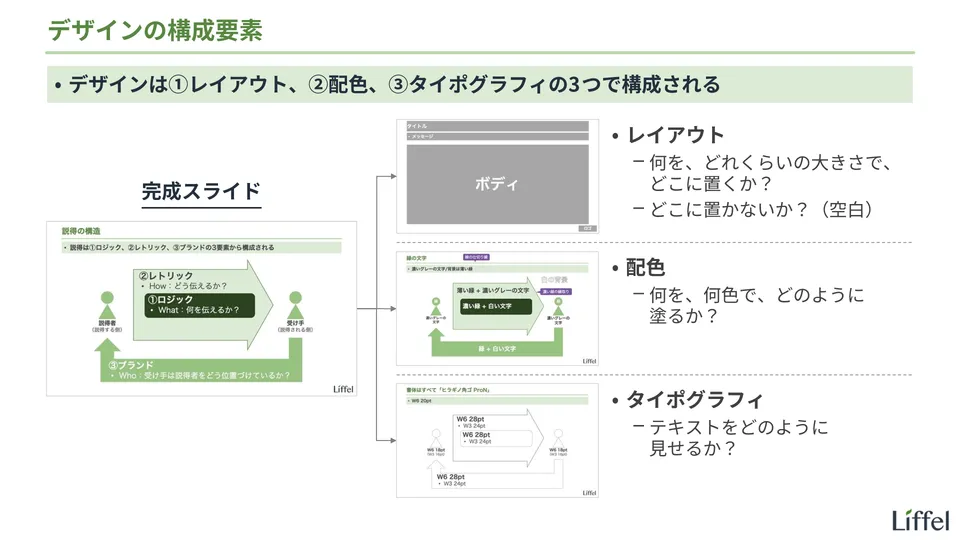
That’s still vague and hard to grasp, though. Take a look at the slide below, which summarizes the big picture of design.
As shown, design consists of the following three elements:
- Layout
- Color
- Typography
As long as you’re not a professional designer and you’re making slides as materials, you can think of design as these three things1.
Let’s look at each in turn.
Element of Design #1: Layout
Layout is deciding “what to place, how large, and where.”
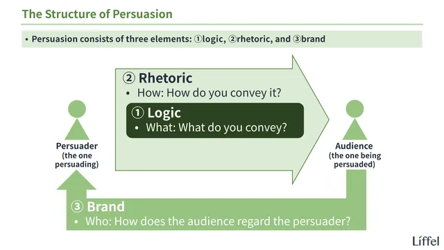
Let me explain using an actual slide. First, take a look at the slide below.
This is the “structure of persuasion” slide introduced in another entry on this site. Since this entry doesn’t explain the content of the slide, read the entry below if you want to learn more.

Back to the topic. Extracting only the layout elements from this slide gives the following. Compare it with the slide above.
Notice the following:
- The title is at the very top of the slide, with its text aligned left
- The message is below the title, with its text aligned left
- Below the message is a large body area
- There’s space for footnotes at the bottom of the slide
- The logo is at the bottom right of the slide
Also pay attention to the areas where nothing is placed, that is, the white space. The white space at the top, bottom, left, and right of the slide is called the “margin,” an area deliberately kept free of content. It isn’t this size by accident.
The amount of white space is an important factor in the impression a slide makes. When thinking about layout, you need to think about white space together with content.
In this way, layout is deciding what to place (or not place), where, and how large.
”Layout” as Part of Design
Note that the word “layout” is sometimes used in a broader sense. It breaks down like this:
- Layout (broad sense): the overall approach to presentation
- Choosing media: which medium to use to express the logic you want to convey and the related images
- Which to use: text, diagrams, tables and graphs, images, etc.?
- Layout (narrow sense): where, and how large, to place the chosen media
- Choosing media: which medium to use to express the logic you want to convey and the related images
As shown, in the broad sense, “layout” includes choosing media. Applied to the slide above, deciding to express the structure of persuasion as a diagram is also part of “layout” in the broad sense. In the narrow sense, it isn’t.
Since this is a matter of how words are used, neither is right or wrong. When learning design, though, it’s clearer to stick to the narrow sense (since there’s no one right answer for choosing media).
Element of Design #2: Color
Next, color is deciding “what to color, in which colors, and how.”
In the same way, extracting the color elements from the slide above gives the following.
Notice the following:
- Background color
- White (light green in areas such as the message)
- Text color
- The title is green
- Other text is dark gray (not black) on white, and white on dark colors
- Shape color
- Three shades of green are used
- Only the rhetoric arrow is outlined in dark green; the other shapes have no outline
- The dividing lines are green
- How things are colored
- Everything is a solid fill; no gradients or the like are used
In this way, color is deciding which colors to use for text and shapes, and how to apply them.
Element of Design #3: Typography
Finally, typography is deciding “how to present text.”
In the same way, here are the typography elements extracted from the slide above.
There’s very little I can add in words here; it’s exactly what you see. Just to be clear, “Bold” and “Regular” are the weights, and the number after them is the text size (in points).
Incidentally, all the fonts are Noto Sans JP for Japanese and Inter for Latin letters and numbers. Since both are free and can be installed on any computer, the slides look the same on Windows and Mac.
In this way, typography is deciding the font, its weight, line spacing, and so on.
Typography vs. Font
By now, many of you may be thinking, “So typography just means fonts?” It breaks down like this:
- Typography: everything about how text is presented
- Font (broad sense): what you can decide with just one character
- Font (narrow sense): a group of characters with a consistent design, such as “Helvetica”
- Variations in form such as bold and italic (font style / font family)
- Text size (font size)
- Text color (font color)
- Font (narrow sense): a group of characters with a consistent design, such as “Helvetica”
- Typesetting: what you can only decide with two or more characters
- Letter spacing
- Line spacing
- Text alignment
- Font (broad sense): what you can decide with just one character
As shown, “font” is one element of “typography.” Typography is the broader concept; the two aren’t synonyms. For example, as listed above, letter spacing and line spacing are part of “typography” but not of “font.”
That said, partly because the word “typography” isn’t all that widespread, there’s no denying the tendency to call everything “font.” Although this is also a matter of how words are used, with no right answer, this site uses “typography” for the sake of accuracy.
Don’t Say “Design”
Finally, a side note: if you want to improve your design skills, I think you should avoid the word “design” as much as possible.
The reason, as I mentioned at the start, is that the word “design” is too broad. When you’re actually working out what’s wrong with a slide’s design, use the words from this entry, such as “layout” and “color,” rather than “design.” Narrowing down what you’re thinking about and improving one thing at a time is the faster route in the end.
That covers what design is.
All presentation-related entries are collected below.
Footnotes
-
My understanding is that professional designers also create and edit images on top of these three (I’m not a professional designer myself, so there may be more). ↩